The electronic Quality Assurance (eQA) Dashboard, like MRC, also has some variations.
The one that you will come across most of the time is based on Power BI, a premium Microsoft technology. The other Dashboards are based on bootstrap and JavaScript technologies.
We will deep dive into the sections within the Dashboards below.
Any Dashboard, or page, can be printed using the “Print Page” button in the upper right corner of the page.

Power BI Dashboards
The first Dashboard that you are presented with after logging in to DHC Systems uses Power BI. This Dashboard gives you a top level view for the day, as well as Sat and UnSat Checks for the last 15 days. MRC appears on the page first, followed by eQA below that.
You can also access this initial Dashboard any time after logging in by clicking “Dashboard” in the navigation bar: ![]()
Next, we will go through each section of the Dashboard for eQA. We will start from the top left, work our way right, then down, to the right, and down to the larger chart.
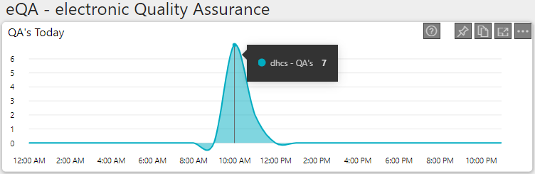
The top left visual is the “QA’s Today” chart. Here you should see an hour-by-hour count of the total QA’s that were conducted.
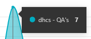
You can hover over any datapoint to see the actual value.
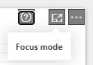
You can also hover your mouse over the upper right corner to reveal “Focus mode”. Clicking this will open the chart in a larger view.
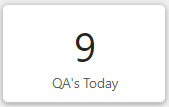
The upper right consists of six cards. The first shows a count of “QA’s Today” which displays the number of Quality Assurance records that were complete for the day.
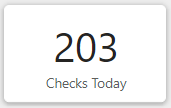
Next to the QA’s is “Checks Today” which provides the number of Checks completed for the day. Remember a QA can have up to 25 Checks associated with it.

The last tile of the row is the number of “Images” that have been uploaded for the day. Each QA that is submitted into the system has the opportunity to have an image attached.
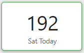
Below the “QA’s Today” tile you will see “Sat Today”. This is a count of the “Sat”, or Satisfactory, Checks that were completed for the day. Adding “Sat Today” and “UnSat Today” will equal the value in the “Checks Today” tile.
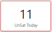
After the Sat Checks count you will find the “UnSat Today” count. This is the number of “UnSat” or Unsatisfactory Checks for the day.
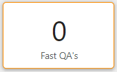
The last tile in this section is the number of “Fast QA’s” that were flagged for the day. Please refer to the “Terminology” article for any definitions that are unfamiliar.
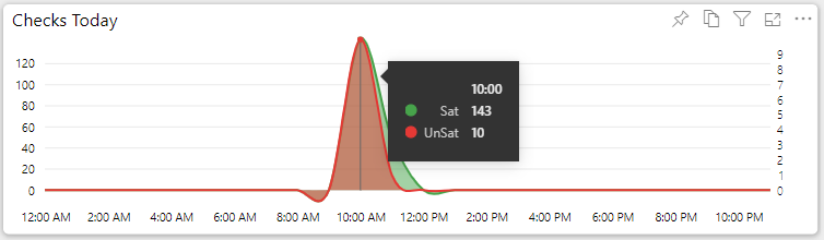
The large chart in the second row is the “Checks Today”. Here you will see the number of Checks conducted throughout the day. Green represents “Sat Checks” and Red represents “UnSat Checks”.
Similar to others charts, you will also notice that hovering over a data point provides additional detail.

Moving to the right from the “Checks Today” chart you will see “Sat Ratio Today”. This will provide the percentage of Checks that were marked as “Sat” vs those that were “UnSat”. A rating of 100% would indicate all Checks conducted were Satisfactory, while a rating of 50% would indicate half were “Sat” and the other half were “UnSat”.
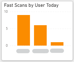
The next tile is “Fast Scans by User”. As indicated in the title of the chart, it is the “Fast Scans” that were flagged in the system for the day, by User.
Clicking the bar above the User to filter some of the other charts.
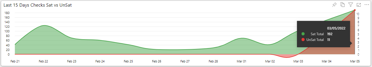
The final chart on the main Dashboard is the “Last 15 Days Checks Sat vs UnSat”. As the title implies, it is the activity of Checks over the last 15 days. Hovering over any of the data points reveals the details of the Sat and UnSat, including the date.
BootStrap and JavaScript Dashboards
BootStrap and JavaScript Dashboards bring some different strengths from the Power BI Dashboards, however, there are some tradeoffs.
Below we will describe each of the types of visuals, and the functionality, you will find within these types of Dashboards.
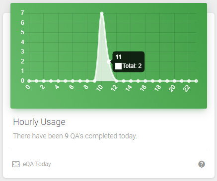
One of the larger charts you come across in eQA will show you “Hourly Usage”.
Similar to the Power BI reports, hovering over a datapoint will bring up additional detail of the data.
Below the chart, you can also see a brief description that summarizes the activity for the day.

As referenced in the “Help and Support” article, hovering your mouse over the “?” icon brings up a tooltip for the card.
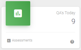
The upper right consists of six cards. The first shows a count of “QA’s Today” which displays the number of Quality Assurance records that were complete for the day.

Next to the QA’s is “Checks Today” which provides the number of Checks completed for the day. Remember a QA can have up to 25 Checks associated with it.
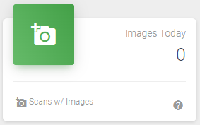
The last tile of the row is the number of “Images” that have been uploaded for the day. Each QA that is submitted into the system has the opportunity to have an image attached.
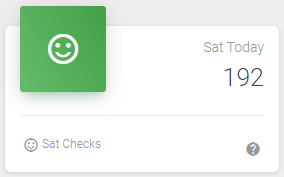
Below the “QA’s Today” tile you will see “Sat Today”. This is a count of the “Sat”, or Satisfactory, Checks that were completed for the day. Adding “Sat Today” and “UnSat Today” will equal the value in the “Checks Today” tile.
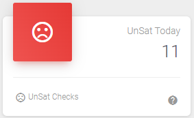
After the Sat Checks count you will find the “UnSat Today” count. This is the number of “UnSat”, or Unsatisfactory, Checks for the day.
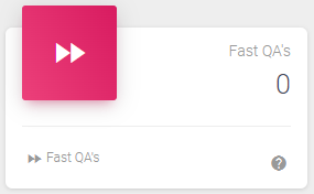
The last card in this section is the number of “Fast QA’s” that were flagged for the day. Please refer to the “Terminology” article for any definitions that are unfamiliar.