MRC – Admin – Reporting
This report is available by expanding the “MRC – Admin” section and clicking “Reporting”, then clicking the “Area” button.
MRC – Admin – Reporting – Area

Here you can see the details of the Scans and Tasks by Day and by Area, or Architectural ID.
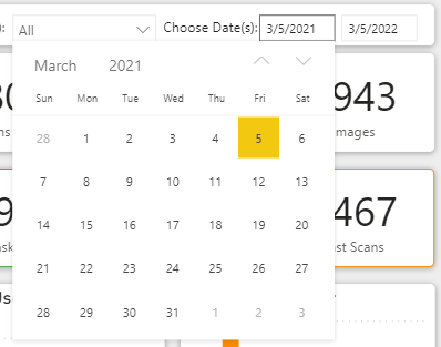
All the way to the right, there is a section for "Choose Date(s):".
Clicking on the date will drop down a calendar to select the start date, and end date, for a report.
The user can also type directly in the date fields without the need to use the calendar selection method.
Clicking the Month and Year will allow for moving up and down in the dates even quicker.
The report page will automatically update based on the selection.
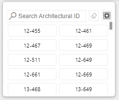
The first visual available in the main body of the “Area” page is the “Search Architectural ID” box.
Start typing the name of an Area and the list will automatically narrow to include what you are searching for.

Once the Area you are looking for shows in the box you can click it to filter the report.
You can click more than one Area by simply clicking the first, then click a another. Clicking a selected Area a second time will deselect it.
To reset the filter click the “Reset filter” button: ![]()
To select all of the search results click the “Select all” button: ![]()

The next card is the “Scans by Architectural ID”.
This chart provides the name of the Architectural ID and the number of Scans completed for it during the period of the report.
By default it shows the most scanned at the top going to the least scanned at the bottom.
Click one of the Architectural ID’s to select it and filter the page.

In the upper row of the page, the first tile is a count of the "Scans" done for the period of the report.
If you chose a month, it is the total scans for the month. If you chose one year, it is the total scans for the year.
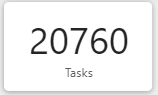
In the upper row of the page, the second tile is the count of "Tasks" done for the period of the report.
As with the previous tile, if you chose a month, it is the total tasks for the month. If you chose one year, it is the total tasks for the year.
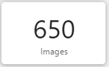
The final tile, is the number of images uploaded for the period of the report.
As with the other tiles, and sections within this page, if a period of one month was selected, it is the images uploaded for the month. If a year was selected, it is the number of uploaded images for the year.

The next tile we will look at is the Sat Ratio.
This is a gauge chart that show the percentage of Satisfactory Tasks for the period of the report.
It is a ratio of Sat Tasks / Total Tasks.
Close to 100% is ideal, however, too close to 100% can indicate more attention to detail is needed during Task completion.
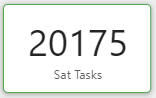
Next we will have a look at the tile labeled “Sat Tasks”. This is a count of the “Sat”, or Satisfactory, Tasks that were completed for the period of the report. Adding “Sat Tasks” and “UnSat Tasks” will equal the value in the “Tasks” tile.
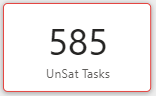
After the Sat Tasks tile, you will find the “UnSat Tasks”. This is a count of the “UnSat”, or Unsatisfactory, Tasks that were completed for the period of the report.
Adding “Sat Tasks” and “UnSat Tasks” will equal the value in the “Tasks” tile.
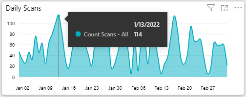
Now lets look at one of the larger charts on the page.
The "Daily Scans" is located in the upper part of the page and gives an aggregate daily view of activity.
Like other reports, hovering over a datapoint will display the numbers behind the report.
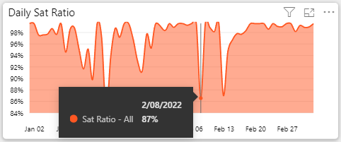
In the next chart we see "Daily Sat Ratio".
This is the daily ratio of the Satisfactory Percentage over the period of the report.
Go ahead and hover your mouse over a day to see specifics about the performance on a particular date.
100% would indicate that all Tasks checked for a day were Satisfactory.
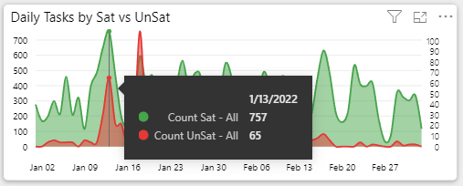
Another one of the large charts is the “Daily Tasks by Sat vs UnSat”.
Here you will see the number of daily tasks conducted throughout the period of the report. Green represents “Sat Tasks” and Red represents “UnSat Tasks”.
Like the other charts, within most parts of the reporting and dashboards, hovering over the datapoint will provide additional detail and the numbers behind the chart.
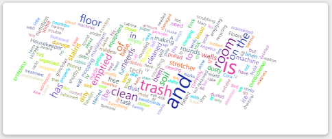
The visual with a bunch of words scattered around is the Word Cloud.
Words that are used more often in the Scan Notes appear larger. The smaller words are used in the Scan Notes less often.
Click a word to see the page filtered for Scans that included that word in the their notes.
It can be quiet enlightening for spotting trends.
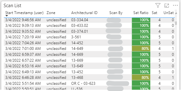
The large table of information in the lower left is the “Scan List”. This is where each of the Scans conducted for the period are listed.
Click a row within this table to show the details, including the image in the visual to the right.
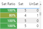
Also, note that the "Sat Ratio" within the "Scan List" uses conditional formatting to help highlight Scans that had a lower than 100% Satisfactory.
The more green, the higher the Satisfactory score. The more red, the lower the score.
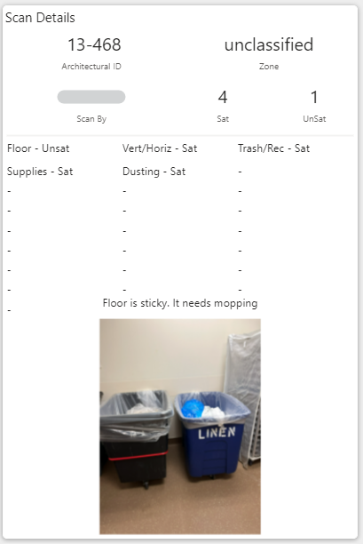
The final part of the page is the “Scan Details” card.
When the user selects one of the rows in the “Scan List” the details of that scan, including the image, will be displayed in the “Scan Details” card.
In this example, you can also see where "Floor" was marked "Unsat" with some notes about what needs to be done to correct it.
Perfect example of how to best leverage the system.
To see a different record, simply click another row in the "Scan List".