Various reports will include an hourly view to them in MRC. Below are a couple of the charts that you will come across when looking at reports that include an hourly view.
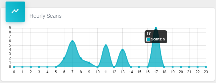
The first chart is the “Hourly Scans”.
This shows the number scans done by hour for the period of the report.
Hovering over a datapoint will bring up the quantity of “Scans” for that hour.
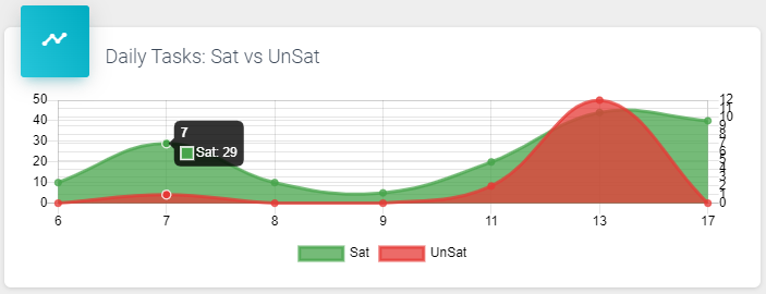
The next chart we will explore is the “Hourly Tasks: Sat vs UnSat”.
This chart shows the hourly Tasks that were completed for “Sat”, or Satisfactory, shown in Green, and “UnSat”, or Unsatisfactory, shown in Red.
Again, hovering over the datapoint will display the details of the information represented.
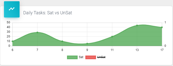
Also, represented in the chart is the Legend showing what each color represents. Try clicking “Sat” or “UnSat” to see the chart filtered.
Note that this is a feature across any report that includes a Legend. ![]()